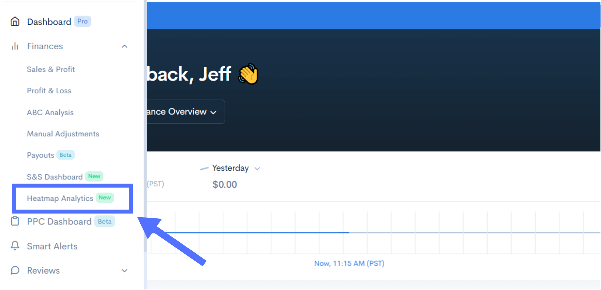
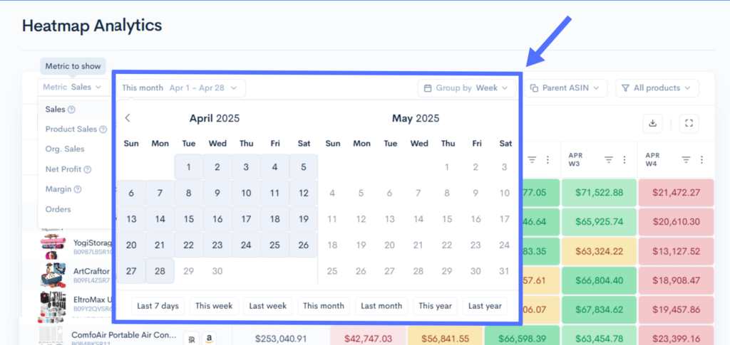
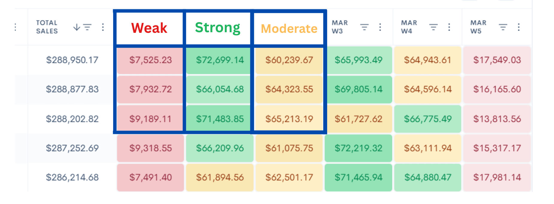
New – Heatmap Analytics Tool: Your Daily Conversion Radar on Amazon

Sellerise Team, Contributor

3 min read -

Updated:

Most Amazon tools show you numbers—conversion rates, sessions, sales. But what if you could see patterns at a glance, identify weak days instantly, and spot trends before they cost you money?

That’s what Heatmap Analytics does.

It’s not just another sales report. It’s a visual performance grid for every ASIN across any time period, color-coded to show when your product is winning—or silently bleeding profits.

Why we built Heatmap Analytics

Amazon sellers often miss hidden trends in daily sales. A product could spike every weekend, tank every Tuesday, or get stuck in a performance slump—and you’d only catch it after it hurts your ranking.

Heatmap Analytics surfaces those trends in seconds, not spreadsheets.

It helps you:

  • Spot top-performing days (🟢 green = great))
  • Flag low-performing outliers (🟥 red = warning)
  • Compare ASINs side by side
  • Track patterns across months
  • Take action faster based on real-time color-coded sales data

​​And even better—it gives you fast answers to the questions that matter most:

💡 See if your promo actually increased profit, not just orders
💡 Spot the best days to run deals based on real buyer behavior
💡 Instantly check if high ad spend days paid off
💡 Know if slow sales came from low traffic, low clicks, or high returns.


Track what matters—beyond just sales

This tool lets you go far deeper than just daily revenue. With a single glance, you can now monitor:

  • Sales
  • Product sales
  • Organic sales
  • Net profit
  • Profit margin
  • Orders
  • Units sold
  • Refund rate
  • Ad spend
  • TACoS
  • ACoS
  • Click-through rate (CTR)
Metric filter dropdown showing sales, profit, and order options in Sellerise Heatmap Analytics

Each of these metrics can be visualized day-by-day with easy-to-understand colors, so you know exactly what changed and when.


How Heatmap Analytics works

Step #1: Open Heatmap Analytics

You’ll find it in the left-hand Sellerise menu.

Step #2: Choose your metric and date range

Select from Sales, Orders, Units Sold, etc. Filter by SKU, marketplace, and custom date ranges (even past 60 days).

Metric dropdown and calendar date filter in Sellerise Heatmap Analytics dashboard

Step #3: Analyze color-coded data

Each cell represents a day. Each color represents performance:

🟢 Green = Strong day. That day worked. Repeat it.

🟡 Yellow = Average. Room to improve.

🔴 Red = Underperforming. Something went wrong.

Now instead of digging through reports, you see the full performance story instantly.


Step #4: Use insights to take fast action

Once you spot a red flag (low sales day), you can manually investigate further using other tools:

→ Funnel View to check your customer behavior changes

→ Keyword Tracker to look at keyword ranking changes

→ Smart Alerts to spot Buy Box losses, traffic drops, or any other changes on your product listing.

→ PPC Dashboard to check your ad performance.


Easy to Use for Everyone

  • Clean, simple interface—no learning curve.
  • Anyone on your team can scan and understand the heatmap immediately.
  • Perfect for coaching VAs, PPC managers, and internal marketing teams.

Try it free
Heatmap Analytics is now included in all paid plans starting at $19.99/month, with a 7-day free trial.

Sign up now →

🧠 Have feedback or feature requests?

We’re building this based on your needs. Click the feedback button in the tool or email us at [email protected].

Sellerise Team, Contributor

Ready to scale your Amazon business?

Free 7 days trial. No Credit Card Required.